SVG 研究之路 (19) - transform 基礎篇
在 CSS3 裏頭,我們常常使用到 transform 這個變形的效果,同樣的,對於 SVG 來說,transform 也是重要的變形屬性,與 CSS 一模一樣,SVG 的 transform 不外乎就是這五個方法:translate、scale、rotate、skew、matrix,這篇將介紹基本的前四個方法,下一篇會繼續介紹 matrix 這個比較複雜的方法。
translate(tx,[ty])
使用 translate 可以讓圖形在 x 軸或 y 軸進行位移 ( 中括號為不是必須的值 ),所謂的位移是指原本的坐標加上多少。
<rect fill="#c00" width="60" height="60" x="0" y="0" />
<rect fill="#09c" width="60" height="60" x="0" y="0" transform="translate(100,50)" />
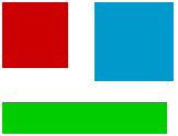
scale(sx,[sy])
scale 可以讓圖形放大或是縮小,若只有設定一個值,則會等比例放大縮小,若設定兩個值,則分別為水平放大或垂直放大,比較需要注意的是,scale 的放大縮小除了寬度和高度,連同坐標也會一併放大縮小,所以一開始使用的時候,會被位置跑掉給嚇到 ( 原因是因為矩陣 Matrix 運算的緣故,會在下一篇解釋 )。
<rect fill="#c00" width="60" height="60" x="0" y="0" />
<rect fill="#09c" width="60" height="60" x="70" y="0" transform="scale(1.2)" />
<rect fill="#0c0" width="60" height="60" x="0" y="70" transform="scale(2.5,1.3)" />
<rect fill="none" width="60" height="60" x="20" y="20" stroke="#000" stroke-width="2" />
<rect fill="#c00" width="60" height="60" x="20" y="20" transform="scale(2)" />
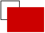
講到這邊其實我們也可以利用 scale 和 translate 搭配,做出鏡射的效果,因為如果我們把 scale 的數值設為負值,圖形會超出 SVG 畫布跑到對應 x 軸或對應 y 軸的位置去 ( 如下圖 )
<rect fill="none" width="60" height="60" x="70" y="50" stroke="#000" stroke-width="2" />
<rect fill="#c00" width="60" height="60" x="70" y="50" transform="scale(-1,1)" />
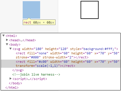
所以我們就必須再使用 translate 把圖形拉回來,就可以做到反轉鏡射了,而這邊也有個小細節要注意,就是如果我們把 translate 與 scale 的順序互換,就會發現 translate 的數值也會由正變負,因為這牽扯到是先形變在位移,還是先位移再形變囉!
<rect fill="none" width="60" height="60" x="70" y="50" stroke="#000" stroke-width="2" />
<rect fill="#c00" width="60" height="60" x="70" y="50" transform=" translate(135) scale(-1,1)" />
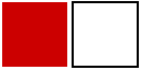
<rect fill="none" width="60" height="60" x="70" y="50" stroke="#000" stroke-width="2" />
<rect fill="#c00" width="60" height="60" x="70" y="50" transform="scale(-1,1) translate(-135)" />
rotate(angle,[cx,cy])
rotate 可以控制圖形的旋轉角度,順時針為正,逆時針為負,旋轉圓心的預設值為 SVG 整張畫布的左上角(0,0),當然我們也可以自訂圓心的座標值。
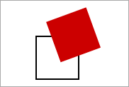
<rect fill="none" width="60" height="60" x="50" y="50" stroke="#000" stroke-width="2" />
<rect fill="#c00" width="60" height="60" x="50" y="50" transform="rotate(-20)" />
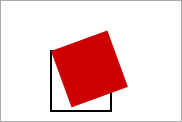
<rect fill="none" width="60" height="60" x="50" y="50" stroke="#000" stroke-width="2" />
<rect fill="#c00" width="60" height="60" x="50" y="50" transform="rotate(-20,50,50)" />
skewX(angle)、skewY(angle)
最後一個基本的方法是 skew 傾斜,分別是要設定 X 與 Y 方向的傾斜角度,不過與 scale 有點相同的地方,使用 skew 之後,也必須使用 translate 把位置調整回來才可以 ( 同樣是因為 Matrix 矩陣運算,在水平或垂直方向上會加上一個 tan(角度) 的數值,也因此位移了 )
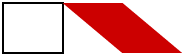
<rect fill="none" width="60" height="50" x="10" y="50" stroke="#000" stroke-width="2" />
<rect fill="#c00" width="60" height="50" x="10" y="50" transform="skewX(50)" />
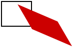
<rect fill="none" width="60" height="50" x="10" y="50" stroke="#000" stroke-width="2" />
<rect fill="#c00" width="60" height="50" x="10" y="50" transform="skewX(30) skewY(30)" />
小結
以上就是基本的 SVG transform,下一篇將仔細介紹 Matrix 的方法。